Feed — Designers' Saturday

With 6000 visitors and 170 exhibitors, Designers' Saturday is the largest and most important showcase for both Norwegian and international design and interior architecture. The biennial's two-day event taking place in Oslo offers a broad range of inspiring gatherings, exhibitions, workshops and parties all over town.

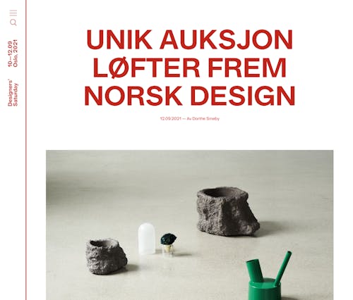
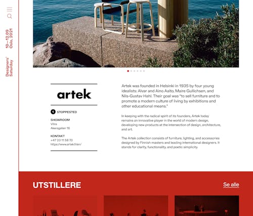
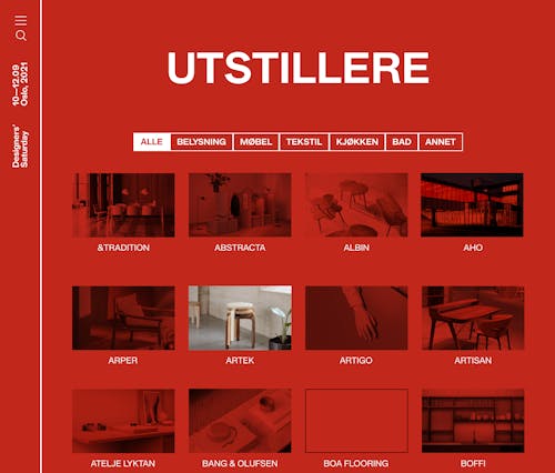
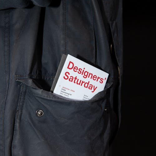
As a well-established brand amongst Norwegian designers and architects, it was important to keep some resemblance to Designers' Saturday's old visual identity. The bright red color is still a key ingredient, but with a fresh and bold typographic approach serving as a solid foundation for further brand development in the years to come.
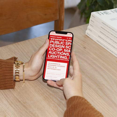

As for the way the website was built, it was important for us to consider the broad audience that Designers' Saturday would reach out to. Designers' Saturday not only appeals to the audience coming to the fair, but also to exhibitors. With that in mind, we revamped the application portal in order to simplify the application process. Another feature that differentiated this website from their previous one was a "news" section, where Designers' Saturday have the opportunity to remain a relevant platform throughout the year.

Our delivery
Visual identity
UX and Digital design
Front-end development
Back-end development


