Feed — Element

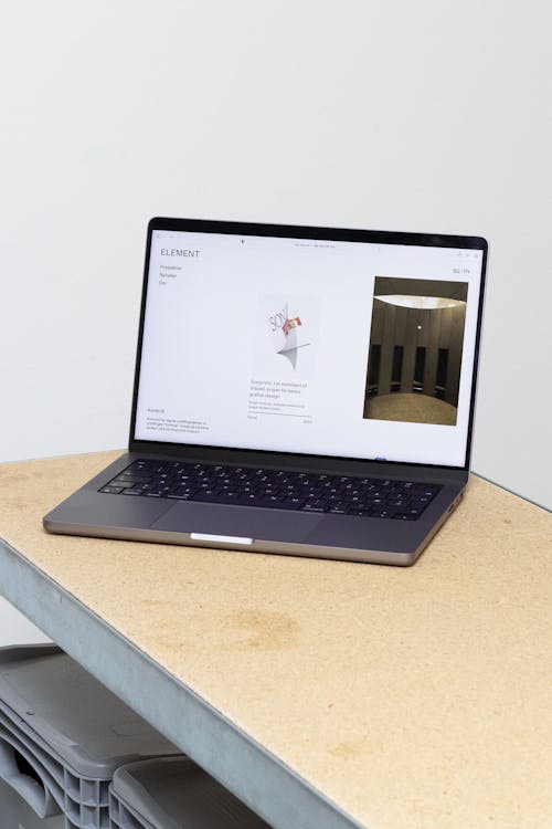
ELEMENT is an architecture firm based in Oslo behind a range of real estate buildings and artistic projects. We delivered the new visual identity, website, communication concept and brand strategy. The core of our delivery has been to visualize and highlight what ELEMENT stands for and what they work on every single day. Since architecture moves slowly, there are many projects which take years to finish – but are still highly relevant to talk about. Hence, the website is centred around the concept of revealing the path towards completion.
Process driven identity
A major challenge for creative industries is to document how much work lies behind a concept in complex structures that architects work with. The main goal for the brand strategy has therefore been to make the process visible, turning inside out what people usually associate with architectural projects, focusing equally on the finished product as much as the process of getting there.
One of the main principles we applied was to treat anything ELEMENT works with as a project in itself: a home, a construction site, a real estate, a transformation, a book, an exhibition or an interior are handled on an equal scale on the website. As a result, the navigation is kept to a minimum: Projects and About Us are the only choices given in the menu.
From ELEMENT to elements
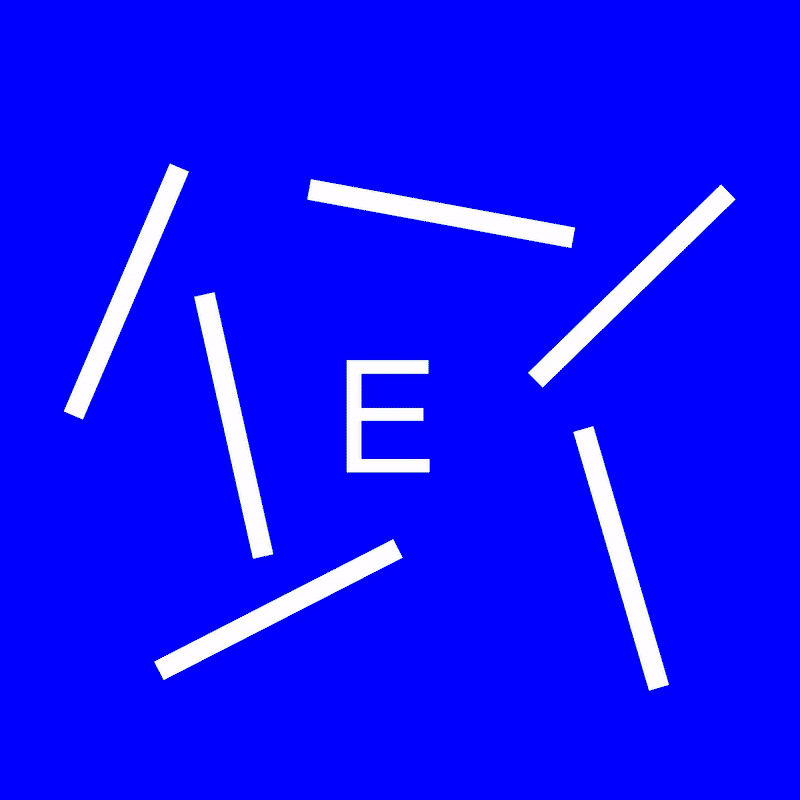
Now to the logo. The word “element” has both a raw and stable connotation as well as referring to something flexible and adaptable. This duality can be traced back to the word’s origin, which is twofold; element both stems from the latin elementum meaning “principle or rudiment” as well as the Greek stoikheion meaning “component or part of a whole”.
The playfulness in which the name has been used visually adapted in order to create a self-embodiment of its own form lies in the decomposition of the word on the upper left side of the page into different “elements”. The name tag thus serves as a representation process for the project.


The more the users scroll down the page and witness the progression and unfinished state of the projects, the further decomposed the name gets. As such, the logo itself interchanges between a polished and unpolished state.
In order to add another layer to the concept, we added dotted lines in the background of the page whenever looking at the progression of each project, which also emphasise the sketching quality by mimicking the architect’s design paper.
The result is a simple yet dynamic identity which fluctuates in the space between raw and polished, finished and unfinished, sketchy and completed. As the concept also involved making the storytelling of each project easier for ELEMENT, we look forward to seeing their use of the publishing tool that we created together in the years to come.


Our delivery
Identity
Digital design
User experience
Front-end development
Back-end development
Social media strategy
More Work


LundhagemNew website for one of Norway's most renowned architect firms.


