Feed — Ratio Arkitekter

Ratio Architects is a renowned architectural firm in Norway focusing on state and communal projects, including the Stavanger Concert Hall, the Grieghall in Bergen and the Oslo University Hospital (Rikshospitalet) among others. We've developed their new visual identity and website.
The new visual identity takes its starting point in their core values; user friendly, caring and practical. Ratio's approach to architecture is highly linked to the projects that they take on, ranging from community buildings and concert halls to hospitals and universities. Such buildings ought to be functional, practical and safe spaces that bring people together.
"Architecture is about creating space for people - the physical environment for human life, activity and interaction." - Ratio
The website is playfully built by interchanging positive and negative spaces, subtly referring to similar architectural concepts, where positive space is often favoured over negative ones. For Ratio, we brought the negative and positive to the same level. Thus, empty or unintended spaces are equally important to the intentional features of Ratio's identity. This is a prominent feature in their logo where the colon is present in the combination of the black square as the title dot of the "i" as well as in the white space in between.
We also integrated touches of different colors in the identity as a contrast to the main interchange of black & white, using the palette of previous projects as a tool. Colors are to be used subtly, to help highlight or mark particular details.
In terms of the website's own architecture, we created a cohesive way of presenting their work, focusing on grid modules that helps categorising the projects and makes it easy for visitors to scroll through.

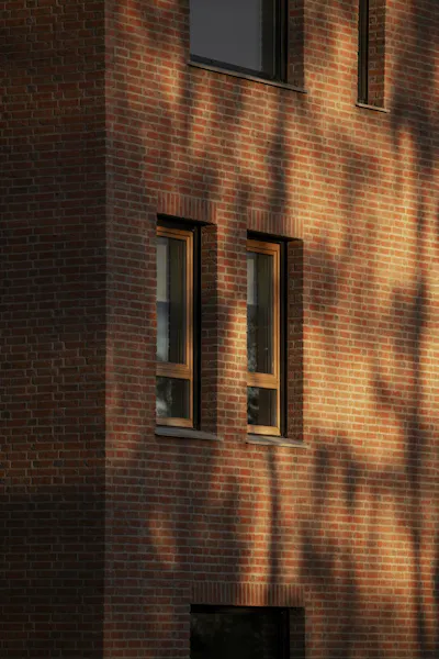

Photo credits
Martina Hansens Hospital by Ivar Kvaal/Hest Agentur
Stavanger Konserthus by Jiri Havran
Universitet i Trømsø by Trond Isaksen
More Work


LundhagemNew website for one of Norway's most renowned architect firms.

